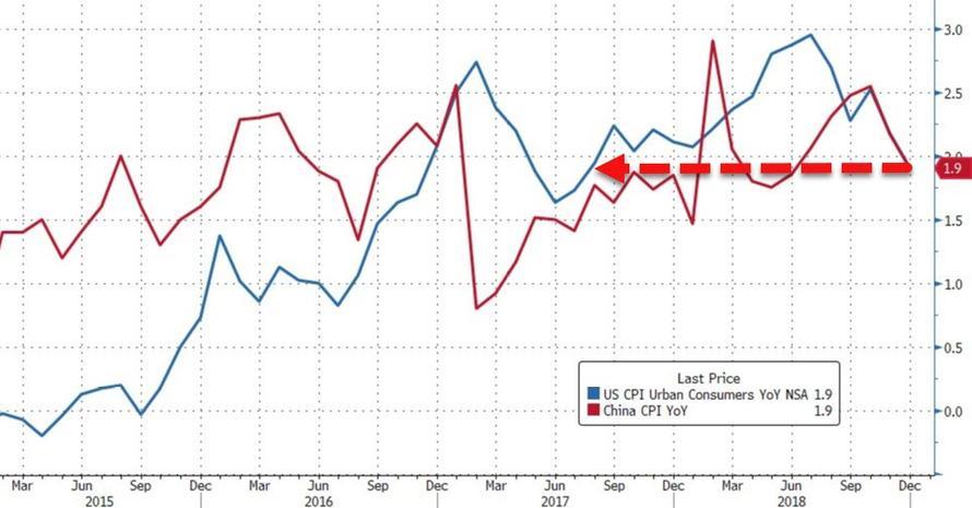
For equity market bulls, Friday’s CPI data couldn’t have been more of a gift if the report came wrapped up with a bow. Falling neatly in line with the market’s expectations, headline core inflation downshifted to 1.9%, the weakest reading since August 2017. Even more importantly, relenting price pressures sent one of the most widely watched inflation gauges back below the Fed’s 2% Maginot Line, handing the “data dependent” central bank more justification to put off hiking rates until H2.

But as is often the case with US data – particularly measures of inflation which chronically under-represent the true level of inflation in the economy, as we have explained in the past – the devil is in the details. And Friday’s print was no exception.
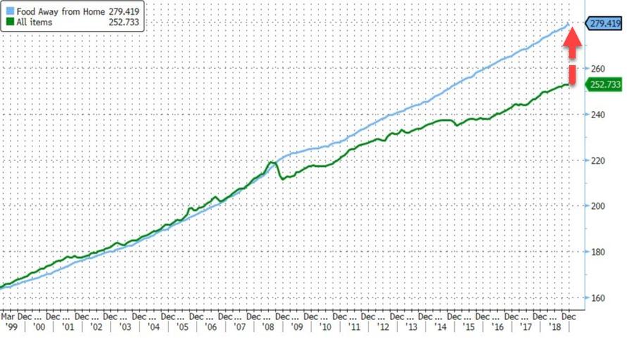
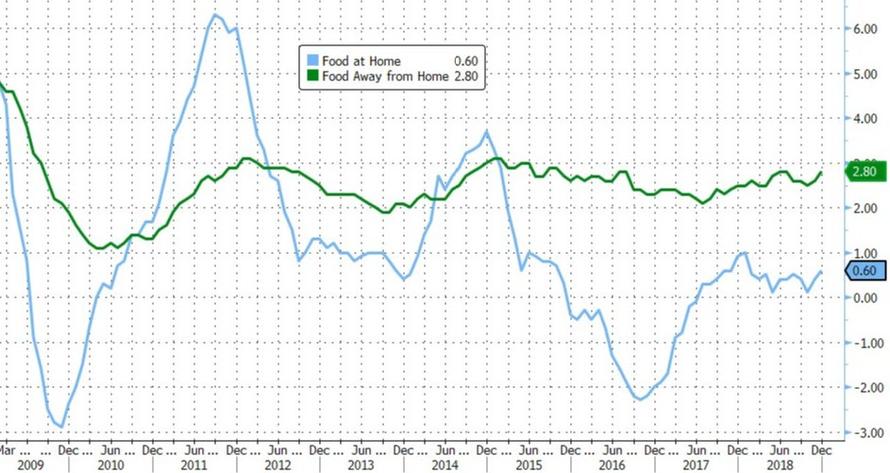
To wit: While headline inflation slipped, the subindex for full-service food and snacks – which represents the costs of dining at full-service restaurants – climbed 0.5%, its largest month-over-month increase since 2011.
So why the reason for the divergence?

Particularly considering that the cost of food – which, as we understand it, is the primary product sold at restaurants – remains below its levels from the beginning of 2018.

While it’s tempting to attribute this to accelerating wage growth or minimum wage hikes, the increase occurred in December; a wave of minimum wage hikes across the US aren’t slated to take effect until next month. And while jobs data have recently reflected a pickup in average wages, restaurant workers mostly rely on tips to get by.
Bloomberg hinted at the incongruity, describing the increase in full-service restaurant prices as a “another headwind for Americans.” In fact, given the many warning signs about consumption in the second half of 2018, including trade-related headwinds and the blow to the “wealth effect” in stocks, it’s almost as if something about this number doesn’t quite add up…
Rising restaurant costs are another headwind for Americans. Even though low gas prices and high consumer confidence suggest a strong environment, market volatility at the end of the year, disappointing holiday sales, headwinds from trade and the U.S. government’s partial shutdown are starting to put some buyers on alert. If questions about global growth continue to persist, restaurant sales could fall victim to an economic slowdown, with consumers opting to save money by eating at home.
…that is, unless it’s really a breadcrumb suggesting that the true rate of inflation in the US economy is actually much higher than the official data would suggest. Of course, if that were true, then it could create serious headaches for investors and participants in the real economy – because not only would the Fed be pressed to accelerate rate hikes, but it would also presumably trigger a damaging repricing in Treasury yields that could ignite a replay of the “Shocktober” market rout.
In light of this, we’d like to highlight once again a report published back in 2017 by Devonshire Research Group which analyzed what its authors described as chronic underreporting of US inflation data. Back then, Devonshire suggested that the true rate of inflation could be as much as three times higher than the official rate. They listed a number of reasons why this might be true, starting with the notion that outdated inflation gauges like the CPI had ceased serving as a “financial tool” to be utilized by investors, and had instead become a “policy tool” used by central bankers to justify their hyper-accomodative monetary policy.
Here’s a summary of Devonshire’s summary conclusions:
-
US official CPI calculation is governed, and possibly distorted, by numerous and complex technical decisions
-
Inflation reporting is less a measure of purchasing power (and therefore a financial tool), and increasingly a process of affecting macro-economic policies (and therefore a policy lever)
-
Real gross domestic product (GDP) measures, yield curves, and treasury issued inflation protected securities (e.g. TIPS), government and union / minimum wages all rely on official US inflation indices that are subject to these distortions
-
Most financial, wealth management models rely on a price stability assumption and default to 3% inflation input – what would happen to these models if the true value was closer to 7-11%?
-
If we re-compute a purchasing power CPI, de-sensationalize contrarian reporting, and remain disinterested with modern economic policies, we arrive at a 7-9% practical CPI rate over the past decade
-
This has profound implications on reported vs. actual standard of living, and might explain the rapid appreciation of American consumer debt, potential reduction in perceived vs. reported quality of life, not to mention unexpected political trends
-
Post-1990 inflation of 7-9%, not 3% would also suggest near “bubble-like” conditions exist across many consumer sectors
* * *
For anybody who doubts the CPI’s importance as a policy-setting tool, consider the following comments made Thursday (a day before the latest CPI print) by Fed Vice Chairman Richard Clarida, who hinted that the recent “slowing” in inflation had lessened the pressure on the Fed to raise interest rates (according to the median projections in the central bank’s latest “dot plot”, Fed policymakers anticipated in December that the central bank would hike rates only two times next year, down from three previously, while expectations for the long-run terminal rate declined to 2.8%, from 3%).
Clarida said in a speech on Thursday that “inflation has surprised to the downside recently, and it is not yet clear that inflation has moved back” to the central bank’s goal on a sustainable basis.
Despite the various sub-indexes published to give investors a more comprehensive breakdown of where pricing pressures are showing up in the economy, the methods used to boil all of this down into a headline number – which is often all anybody looks at – remain surprisingly opaque.
Which means the data are much more prone to manipulation than many might understand.